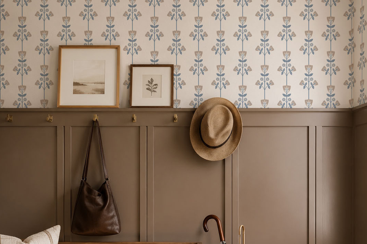
Wallpaper Trends 2026: Colours, Patterns and a Look Ahead to 2027
07.10.2026 Posted by Pattern & Hue
The most useful wallpaper trends offer ideas you can make your own. A deep botanical print might give a dining room the atmosphere you have been looking for. A gentle stripe can bring structure to a quiet bedroom. A warm white background can let a pattern breathe without making the room feel empty.
For our 2026 edit, we are looking at the meeting point between colour, texture and individual style. There is room for both a calm backdrop and a more expressive interior. The choice depends on how you want the room to feel, and how the wallpaper sits alongside the furniture, materials and objects you already enjoy.
Soft whites that leave space for a pattern
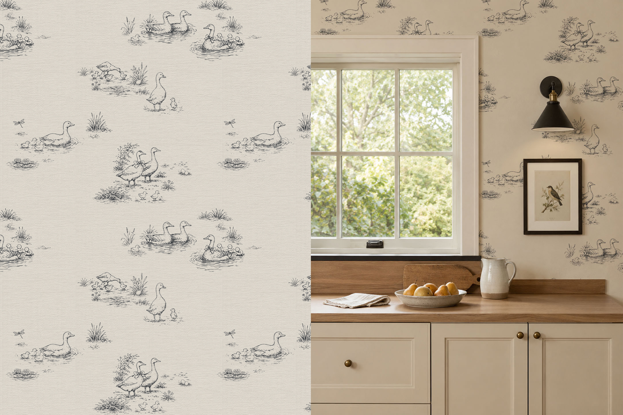
Pantone’s Color of the Year 2026 is PANTONE 11-4201 Cloud Dancer, an airy white. It provides a useful reference for interiors where a light background is allowed to do some of the work.
Our interpretation is to pair a soft white ground with a fine botanical line, a quiet geometric motif or a restrained stripe. The room still has a pattern, but the contrast is gentle enough to leave space for wood, woven textiles and personal details.
When selecting a pale wallpaper, compare the sample with your ceiling, trim and upholstery. A white that feels warm beside oak may look different next to a cool white cabinet. Look at it in the room itself, rather than choosing from a screen alone.
Botanicals with a sense of history
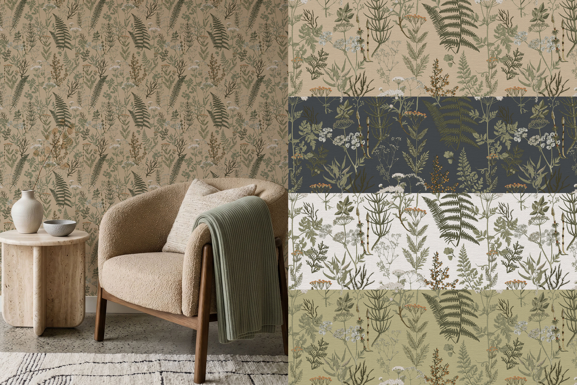
Flowers and leaves can be delicate, graphic or full of decorative detail. For your own home, the interesting part is how a botanical pattern connects with the rest of the room. A small floral can soften the structure of a hallway; a larger motif can make a dining room feel more immersive. A vintage-inspired print does not need an entirely traditional setting. Try it beside a simple contemporary table, a clean-lined sofa or understated lighting.
Pattern & Hue’s botanical and vintage designs offer different ways to explore this idea, from quieter repeated motifs to a more expressive wall. Choose the scale and colour that support your space rather than trying to reproduce a complete trend image.
Rich colour that feels comfortable to live with
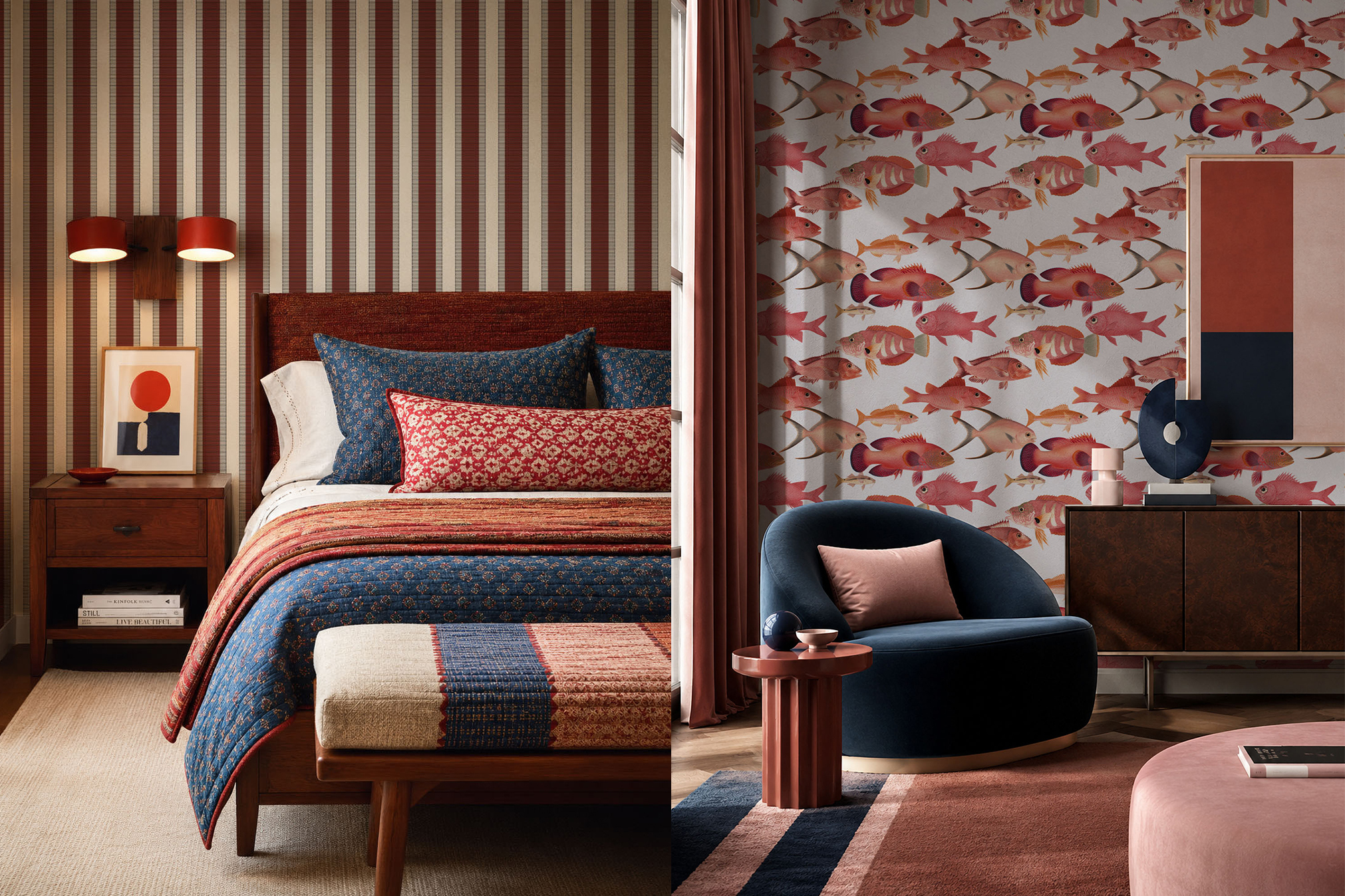
A deep colour can become the setting for a room rather than just its accent. Burgundy, plum, olive and darker blue offer useful directions to explore alongside natural wood, warm metal and pale textiles.
For a more enveloping scheme, take a colour from the wallpaper into the surrounding paint or fabric. For a lighter result, use the print on one wall and repeat a smaller amount of its colour elsewhere. These are design approaches, not rules about which colour every home should use.
Pattern & Hue offers custom colour options, which can help you connect a design with an existing piece of furniture or a favourite fabric. Always check a printed sample: the surface and the room’s light affect how the final colour appears.
Stripes, geometric shapes and texture
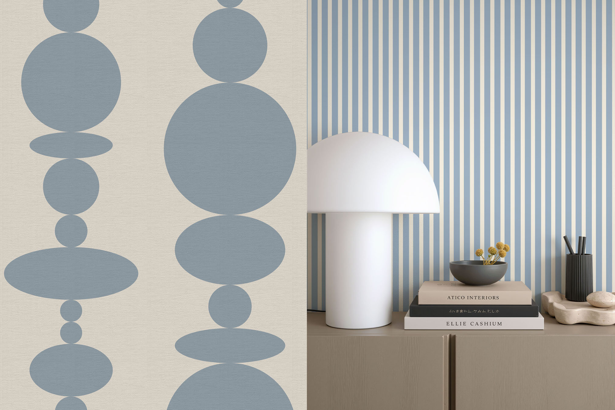
For a less floral direction, look at stripes and geometric designs. They bring rhythm into a room and can be as restrained or playful as the colour palette allows. A narrow stripe provides a different impression from a broad band, just as a small geometric repeat feels different from an oversized shape.
Rather than treating pattern and texture as separate decisions, consider them together. A smooth matte material can emphasise fine printed detail. A fabric surface adds a subtle tactile layer, while natural grasscloth brings the weave itself into view.
To combine patterns, start with a shared colour and vary their scale. A small floral and a broader stripe can feel connected without competing at the same visual size. Give yourself room to edit, using a plain surface or simpler textile where the scheme needs a pause.
A look ahead to 2027: blue, earthy pink and expressive florals
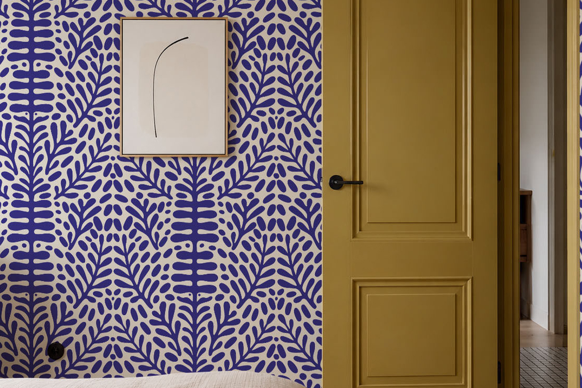
There are already published reference points for 2027. WGSN and Coloro selected Luminous Blue as their Colour of the Year 2027, with Coloro code 125–28–38. This is their forecast, separate from Pantone’s annual selection.
Our design interpretation is to try a more vivid blue within a familiar pattern: a crisp stripe, a graphic shape or a botanical print with a pale background. You can start with a smaller area if you want to explore the colour before committing to a whole room.
For a Pattern & Hue scheme, try muted pink with a botanical motif, or use a blue pattern alongside warm neutrals. The point is to translate an interesting idea into your own room, with a sample that lets you see the result before ordering.
Choose the version you will enjoy beyond the year
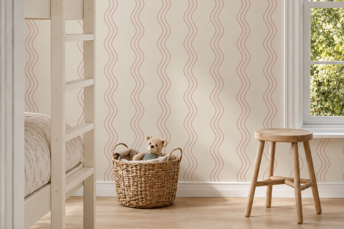
Begin with the mood you want, then think about scale, light and material. A reading corner might call for a quiet repeated motif; a dining room may welcome a bolder print. Compare wallpaper samples with the surfaces already in place and consider how the design feels when you see more than a single small section.
A trend can open up a possibility you had not considered. Your final choice should still feel connected to your home.